The Silhouette Test Or: How to Make Your Brand Stand Out from the Crowd
Blending in works for some people: spies, snipers, students with anxiety who don’t want to be called on by the teacher, etc. It’s important to what they do on an almost daily basis. Businesses are pretty much the opposite. Businesses don’t benefit from anonymity; far from it. Instead, businesses shrivel up and die like old produce if they’re not being noticed.
We hesitate to call businesses “attention-seeking,” but then again we are talking about the portion of humanity that invented advertisements. Rarely, if ever, is anonymity synonymous with success for a business. That’s why we all work so hard to toot our own horns, to get the word out, to make sure the reviews are positive, and so forth.
Here’s the catch, though: there’s a lot of businesses out there. And just like people, when you have enough businesses all gathered together, you stop looking like individuals and start looking like a faceless crowd. And if potential customers can’t tell the difference between you and your competition, then your business isn’t very likely to win those customers over.
Now marketing is usually designed to address this problem, but mediocre ads are simply being ignored, and self-centered, overly promotional content or social media campaigns are quickly unfollowed. Here again, the rank and file of businesses are indistinguishable from their surroundings, and it’s severely damaging their ability to get noticed by their markets.
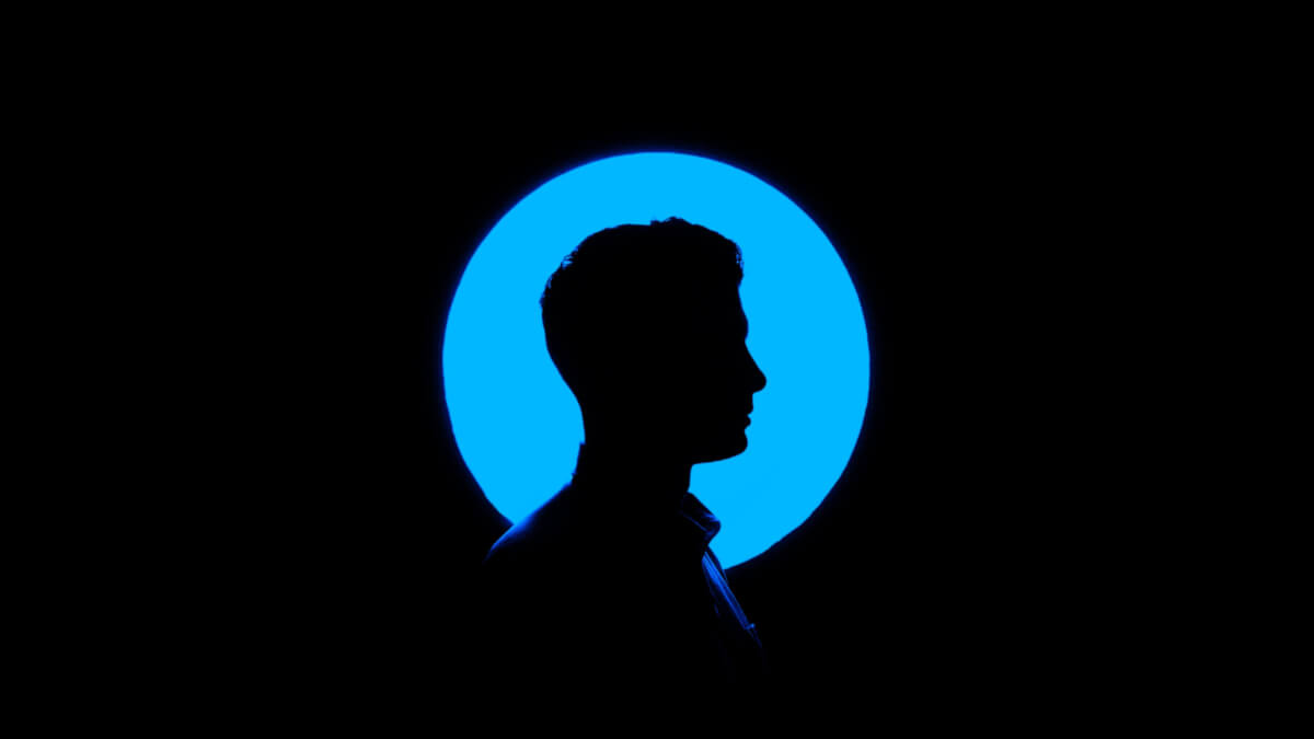
A Distinguished Image
Marketing isn’t the only discipline/industry that deals with this “blending in” problem. In fact, it’s a serious issue for two totally unrelated industries: illustration and animation.
From the earliest days of comics and animation, talent artists distinguished themselves and differentiated their works from the works of others by making them look different. The art style of one artist or animation studio stood out as unique from others because they had to in order to deliver a unique experience to viewers and readers.
Take, for instance, the difference between Mickey Mouse and Bugs Bunny. The styles of the two are distinct and instantly recognizable. It’s this separation that helped people identify and choose their favorites.
But that wasn’t enough. Artists started to realize that, within the body of their own works, viewers or readers had a hard time telling characters apart from one another, especially if there were large groups of characters together with identical profiles.
So they developed a simple guideline called the Silhouette Test to increase the clarity of their craft.
How the Test Works
Have you ever noticed how easy it is to identify characters from comics, cartoons, and animated movies? There’s a reason for it. The artists are purposefully making each major player in the story look visually distinct. Here’s how they do it.
When creating a character, the artists take steps to make each character look so unique that even if they were only seen as a silhouette, they would be instantly recognizable. Essentially, they should have a profile so different from every other character in the story (and every other comic/cartoon) that they could never be mistaken for someone else.
In the event a character isn’t clear from just their shadow, it’s either back to the drawing board, or into the rubbish bin.
Now, you might be thinking “that sounds like an awful lot of work, making each character look different,” to which we would say three things. First, yes, technically you’re right, but that adds to job security. Second, the obviously don’t do it for every character; one-offs and background characters are given just enough detail to fit in without detracting from the main characters.
And third? If there’s one thing creative types hate, it’s doing the same thing over and over. So getting to make each character look new is just an excuse to flex their creative muscles.
The Silhouette Test in Action
What on Earth Does This Have to Do With Marketing?
Good question, but we’re betting you’re connecting the dots already. See, when it comes to marketing, and specifically brand voice, a concept similar to the silhouette test can be applied. Obviously, we’re not working with animated characters, and minus videos and visual ads there’s not an optical component to it. But the concept still applies.
When you’re developing your brand voice, you want that voice to be distinct. The level of professionalism, the level of seriousness or playfulness, the brand of humor (if any), the vocabulary and cultural references, it all adds up to something unique—or, it should. You want your brand voice to feel like a person’s voice, and you want that person to be someone your audience will actually like.
This is not an easy thing to get right. First of all, it takes a rather intimate understanding of your audience and what kind of personality they have an affinity for. Then, it takes an ability to talk to them as one of their own, and an understanding of what kinds of interactions they will value most.
Ideally, you’ll build a well-defined voice and style guide that your team can reference when creating ads or writing posts. You won’t have that at the start, though, and you’ll likely do some adjustments to find the right voice before you can put a guide together.
Once you have the voice figured out, however, it’s important to keep it consistent across all of your marketing materials. As mentioned above, you want the brand voice to seem like a person, and your audience will get confused if it seems like that person is a little schizophrenic. If you’ve built the style guide right, the voice will pretty much keep itself.
Examples of the Silhouette Test in Action
Ok, time to give you some proof of how this works. There’s a number of excellent examples of brand voices that instantly recognizable. A humorous example is Denny’s. The restaurant chain manages a Tumblr that features a unique brand of quirky, absurdist humor based around the foods they serve. It’s honestly something you have to see to believe.
In a similar vein, there’s Skittles, a brand that also employs an odd sense of humor in their social media and video advertisements. It’s all delightfully weird and does a really good job of keeping their products top-of-mind.
For a more down-to-earth example, take a look at Disney. All of their content, from their movies and TV programs, to their marketing campaigns and ads, to the way they operate their theme parks, the core values are “dreams can come true” and transporting people into a world of excitement and fantasy. While some victories come at a cost, there are no bad endings in the magical world of Disney.
Conclusion
Building a unique brand voice can be difficult—we’ll likely talk about the finer points of how to do it in a future post—but the payoff for doing so is immense. If you do it right, you’ll connect with your customers both old and new, and you’ll establish a level of brand loyalty you’ve never seen before.
So stop blending in, and stop disappearing into the crowd. Give yourself a defined brand voice, and start achieving the growth you’ve always wanted.

Stephen is the Dark Lord of content: he’s prone to meticulous planning, empire-building, witty quips, and maniacal laughter. He also may, or may not, be immortal—time will tell.
